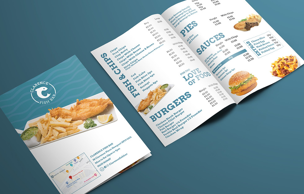
Clarence Fish Bar, a new addition to Newport, collaborated with us to design a distinctive and minimalistic brand identity that stands out in the competitive market. At the core of the design is a unique logo featuring a clever design of a curled fish cleverly integrated into the letter C, embodying the essence of the brand.
Following the creation of the initial logo, our design extended to crafting digital and printed menus.


.jpg)

.jpg)

The clean, minimal logo was enhanced by the use of soft blue tones, creating a cohesive visual identity. This thoughtfully selected colour palette, not only boosts brand recognition but also aligns with the owner’s vision for a fresh and distinctive presence in the competitive fish bar market.
Services: Branding, graphic design